妙用 background 实现花式文字效果
本文将讲解如何利用 background 系列属性,巧妙的实现一些花式的文字效果。通过本文,你将可以学到:
- 通过
background-size与background-position实现酷炫的文字下划线效果 - 通过
background-size与background-position以及background-clip实现文字逐个渐现的效果
起因
写本文的动机是在于,某天,被这样一个标题所吸引 -- 10 Masterfully Designed Websites,其中列举了 10 个极具创意的 Web 网站。
其中一个 Red Bull Racing 网站,是介绍关于 F1 红牛车队的主页。其中有这样一个非常有意思的 Hover 动画效果
 这个文字的 hover 出现效果,看似简单,其实想要完全实现它,仅仅依靠 CSS 是非常复杂的,其中一个比较难的地方在于 -- 如何让一个效果,逐渐作用给整段文字中的部分,而不是一次将整个效果赋予整段文本。
利用 background 实现文字的下划线效果
到这里,我想起了之前在这篇文章中 -- CSS 文字装饰 text-decoration & text-emphasis,我介绍的一种 使用 background 模拟下划线 的效果。
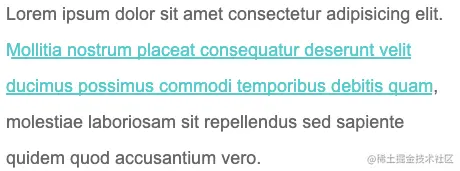
看个简单的 DEMO,使用 background 模拟文字的下划线效果:
<p>Lorem ipsum dolor sit amet consectetur adipisicing elit. <a>Mollitia nostrum placeat consequatur deserunt velit ducimus possimus commodi temporibus debitis
quam</a>, molestiae laboriosam sit repellendus sed sapiente quidem quod accusantium vero.</p>
p {
width: 600px;
font-size: 24px;
color: #666;
}
a {
background: linear-gradient(90deg, #0cc, #0cc);
background-size: 100% 3px;
background-repeat: no-repeat;
background-position: 100% 100%;
color: #0cc;
}
使用 background 模拟文字的下划线效果,效果图如下:
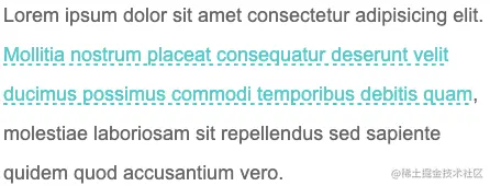
又或者,使用 background 模拟虚线下划线:
 Demo:
Demo:当然这个是最基础的,巧妙的运用 background 的各种属性,我们实现各种有意思的效果。
巧妙改变 background-size 与 background-position 实现文字 hover 动效
这里,通过巧妙改变 background-size 与 background-position 属性,我们可以实现一些非常有意思的文字 hover 效果。
先看这样一个 Demo,核心代码作用于被 <p> 标签包裹的 <a> 标签之上:
<p>Lorem ipsum dolor sit amet consectetur adipisicing elit. <a>Mollitia nostrum placeat consequatur deserunt velit ducimus possimus commodi temporibus debitis
quam</a>, molestiae laboriosam sit repellendus sed sapiente quidem quod accusantium vero.</p>
a {
background: linear-gradient(90deg, #ff3c41, #fc0, #0ebeff);
background-size: 0 3px;
background-repeat: no-repeat;
background-position: 0 100%;
transition: 1s all;
color: #0cc;
}
a:hover {
background-size: 100% 3px;
color: #000;
}
我们虽然,设定了 background: linear-gradient(90deg, #ff3c41, #fc0, #0ebeff),但是一开始默认它的 background-size: 0 3px,也就是一开始是看不到下划线的,当 hover 的时候,改变 background-size: 100% 3px,这个时候,就会有一个 0 3px 到 100% 3px 的变换,也就是一个从无到有的伸展效果。
看看最后的效果:


由于设定的 background-position 是 0 100%,如果,设定的 background-position 是 100% 100%,我们可以得到一个反向的效果:
// 其他都保持一致,只改变 background-position,从 0 100% 改为 100% 100%
a {
...
background-position: 100% 100%;
...
}
再看看效果,你可以对比着上面的动图看看具体的差异点在哪:
OK,如果我们使用 background 实现两条重叠的下划线,再利用上述的两个不同的 background-position 值,我们就可以得到一个更有意思的下划线 hover 效果。
CSS 代码示意,注意看两条使用 background 模拟的下划线的 background-position 的值是不一样的:
a {
background:
linear-gradient(90deg, #0cc, #0cc),
linear-gradient(90deg, #ff3c41, #fc0, #8500d8);
background-size: 100% 3px, 0 3px;
background-repeat: no-repeat;
background-position: 100% 100%, 0 100%;
transition: 0.5s all;
color: #0cc;
}
a:hover {
background-size: 0 3px, 100% 3px;
color: #000;
}

可以得到这样一种效果,其实每次 hover, 都有两条下划线在移动:
通过 background-size 与 background-position 配合 background-clip 实现文字的渐现
上述一大段都在围绕 -- 下划线。
回归到本文一开始提到的 Gif 效果,我们能否实现在一段文字中,实现文字的渐现效果呢?
上述技巧利用的是 background,那么 background 背景色能否改变文字的颜色的?答案是可以的,只需要借助 background-clip。
我们稍微改造下代码,实现利用 background-clip 实现 hover 的时候部分文字逐渐改变颜色:
<p>
Lorem ipsum dolor sit amet consectetur adipisicing elit.
<a>Mollitia nostrum placeat consequatur deserunt velit ducimus possimus commodi temporibus debitis quam, </a>
molestiae laboriosam sit repellendus sed sapiente quidem quod accusantium vero.
</p>
p {
color: #666;
cursor: pointer;
}
a {
background: linear-gradient(90deg, #fc0, #fc0);
background-size: 0 100px;
background-repeat: no-repeat;
background-position: 0 100%;
background-clip: text;
transition: .6s all linear;
}
p:hover a {
background-size: 100% 100%;
color: transparent;
}

看看效果,通过 background-clip: text 的遮罩裁剪,我们将 background: linear-gradient(90deg, #fc0, #fc0) 背景色作用给了文字,同时利用 color: transparent 让文字展示出背景色的色值:
当然,稍微对上述代码变形,我们就可以演化出几种不同的效果。
实现整段文字的渐现 - 从透明到出现
第一种就是从透明到有颜色,逐渐展现,这里我们只需要让 color 一直是 transparent 即可(下述效果借助了一个按钮去触发效果):
<div class="button">Button</div>
<p><a>Lorem ipsum dolor sit amet consectetur adipisicing elit. Mollitia nostrum placeat consequatur deserunt velit ducimus possimus commodi temporibus debitis
quam, molestiae laboriosam sit repellendus sed sapiente quidem quod accusantium vero.</a></p>
a {
background: linear-gradient(90deg, #fc0, #fc0);
background-size: 0 100px;
background-repeat: no-repeat;
background-position: 0 100%;
color: transparent;
background-clip: text;
}
.button:hover ~ p a {
transition: .8s all linear;
background-size: 0 100px, 100% 100%;
}
效果如下:
实现整段文字的渐现 - 从一种颜色到另外一种颜色
还可以实现文字从一种颜色到另外一种颜色的逐个转变,只需要添加多一层 background-image 渐变。
<div class="button">Button</div>
<p><a>Lorem ipsum dolor sit amet consectetur adipisicing elit. Mollitia nostrum placeat consequatur deserunt velit ducimus possimus commodi temporibus debitis
quam, molestiae laboriosam sit repellendus sed sapiente quidem quod accusantium vero.</a></p>
a {
background:
linear-gradient(90deg, #999, #999),
linear-gradient(90deg, #fc0, #fc0);
background-size: 100% 100%, 0 100px;
background-repeat: no-repeat;
background-position: 100% 100%, 0 100%;
color: transparent;
background-clip: text;
}
.button:hover ~ p a {
transition: .8s all linear;
background-size: 0 100px, 100% 100%;
}
这里需要解释一下,虽然设置了 color: transparent,但是文字默认还是有颜色的,默认的文字颜色,是由第一层渐变赋予的 background: linear-gradient(90deg, #999, #999), linear-gradient(90deg, #fc0, #fc0),也就是这一层:linear-gradient(90deg, #999, #999)。

当 hover 触发时,linear-gradient(90deg, #999, #999) 这一层渐变逐渐消失,而另外一层 linear-gradient(90deg, #fc0, #fc0) 逐渐出现,借此实现上述效果。
简单模拟题图效果
这里,我们简单利用这个技巧模拟一下文章一开始列出的 Gif 的效果:
 这个效果原作者的技巧是:
- 将每个单词作为一个对象,包裹一个特殊的 class
- 利用
animation-delay将动画逐渐赋予每个单词
这里,我们将整段文本统一处理,简单还原:
<div class="button">Button</div>
<p><a>Lorem ipsum dolor sit amet consectetur adipisicing elit. Mollitia nostrum placeat consequatur deserunt velit ducimus possimus commodi temporibus debitis
quam, molestiae laboriosam sit repellendus sed sapiente quidem quod accusantium vero.</a></p>
a {
background:
linear-gradient(90deg, #ff5722, #ff5722),
linear-gradient(90deg, #aaa, #aaa);
background-size: 100% 100%, 0 100px;
background-repeat: no-repeat;
background-position: 100% 100%, 0 100%;
cursor: pointer;
color: transparent;
background-clip: text;
line-height: 3;
opacity: 0;
}
.button:hover ~ p a {
transition: 1.2s background .3s ease-out, .8s line-height ease-out, .6s opacity ease-in;
background-size: 0 100px, 100% 100%;
color: transparent;
line-height: 1;
opacity: 1;
}
/ ** 简单控制半透明黑色遮罩出现 **/
a::before {
content: "";
position: fixed;
background: rgba(0, 0, 0, .8);
top: 0;
left: 0;
right: 0;
bottom: 0;
z-index: -1;
transition: .3s all linear;
opacity: 0;
}
.button:hover ~ p a::before {
opacity: 1;
}
效果如下:

可以看到,由于是整体控制整段文本,效果上没有逐个单词控制的好,但是优点是代码量非常少。对于一些简单卡片类的 hover 场景,足以。
完美还原题图效果
当然,题图效果使用纯 CSS 也是不在话下的。只不过就不是简单能够统一处理的了。
这里,我们需要对每一个单词进行精细化的处理,并且使用每个单词的伪元素进行额外的动画。
简单的结构如下:
<div class="button">Button</div>
<div class="g-wrap"></div>
<p>
<span data-text="Lorem">Lorem</span>
<span data-text="ipsum">ipsum</span>
<span data-text="dolor">dolor</span>
<span data-text="sit">sit</span>
<span data-text="amet">amet</span>
// ... 类似结构
</p>
可以看到,每个单词都被 <span> 包裹,并且添加了 data-text,方便伪元素拿到当前单词。
接下来,就是设定动画,并且通过顺序给每个 <span> 添加相应递增的 animation-delay 以实现没个单词动画的差异性。核心的伪代码如下:
p {
position: relative;
width: 500px;
overflow: hidden;
}
p span {
position: relative;
display: inline-block;
opacity: 0;
transform: translateY(15px) translateZ(0);
transition-property: transform, opacity;
transition-duration: .3s, .2s;
}
.button:hover ~ p span {
opacity: 1;
color: #ddd;
transform: translateY(0) translateZ(0);
transition-duration: 1s, .2s;
}
p span:after,
p span:before {
position: absolute;
content: attr(data-text);
top: 0;
left: 0;
z-index: 1;
transform: translateZ(0);
}
p span:after {
color: #e62541;
transition-property: opacity;
transition-duration: .1s;
}
.button:hover ~ p span:after {
opacity: 0;
transition-property: opacity;
transition-duration: .4s;
}
@for $i from 1 to 21 {
p span:nth-child(#{$i}) {
transition-delay: #{$i * 0.04}s;
&::after {
transition-delay: #{$i * 0.04 + 0.2}s;
}
}
}
其实动画本身不太复杂,主要讲两点:
- hover 状态下和非 hover 状态下的
transition-duration是不一样的,是因为取消 hover 过程中,动画消失过程的时间通常是要求更短的; - 借助了 SASS 的循环
@for $i from 1 to 21 {}递增给每个 span 和它的伪元素添加了递增的 transition-delay;
最终,我们可以得到如下的结果:

完整的代码,你可以猛戳:csscoco.com/inspiration…
如果您觉得这篇文章有帮助,请点个赞吧~
评论
请登录后发表评论
去登录