如何实现渐变色 圆角与倒角 边框
2024-10-08
804 字约 3 分钟
...1、完整代码及样式示例
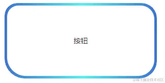
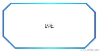
1.1. 渐变色 圆角/倒角 效果图
圆角
倒角
1.2. 渐变色 圆角/倒角 完整示例代码
渐变色色值:linear-gradient(270deg,rgba(34,117,211,1) 0%,rgba(14,244,243,1) 49%,rgba(34,117,211,1) 100%)
边宽:5px
宽:300px
高:150px
圆角值: 左上25px 右上30px 右下35px 左下40px
类型:圆角(若想要查看倒角样式,将borderType设置为chamfer即可)
2、前景提要
圆角渐变色边框不支持圆角
.fillet-gradient-color-box {
display: flex;
justify-content: center;
align-items: center;
width: 400px;
height: 200px;
border: 1px solid transparent;
border-image: linear-gradient(270deg,rgba(34,117,211,1) 0%,rgba(14,244,243,1) 49%,rgba(34,117,211,1) 100%) 1;
border-image-slice: 1;
}
圆角纯色边框不支持渐变色
.fillet-pure-color-box {
border: 1px solid #9ba2b0;
border-radius: 20;
}
所以当我们需要满足既要**支持圆角**,又要**支持渐变色**的时候,就没有直接可以使用的css样式可以实现
圆角背景色设置渐变,after切割出圆角效果
【注】这种效果的缺陷是背景颜色不能有透明度,不然被叠加遮盖住的_background-image_颜色就会显示出来
.border-radius-demo {
width: 400px;
height: 400px;
position: relative;
display: flex;
justify-content: center;
align-items: center;
background-image: linear-gradient(270deg,rgba(34,117,211,1) 0%,rgba(14,244,243,1) 49%,rgba(34,117,211,1) 100%);
border-radius: 25px 30px 35px 40px;
}
.border-radius-demo:after {
content: "";
position: absolute;
left: 5px;
top: 5px;
z-index: 10;
width: calc(100% - 10px);
height: calc(100% - 10px);
border-radius: 25px 30px 35px 40px;
background-color: red;
}
倒角结合边框配置单纯切割图形实现的倒角,会出现切割部分没有边的问题
【注】一下这种矩形裁切方式,会将四个角裁去的部分中边框的部分同样裁去,最终并不是想要实现的效果
.chamfer-gradient-color-box {
width: 400px;
height: 200px;
border: 3px solid transparent;
border-image: linear-gradient(270deg,rgba(34,117,211,1) 0%,rgba(14,244,243,1) 49%,rgba(34,117,211,1) 100%) 1;
border-image-slice: 1;
background-color: rgb(103, 235, 63);
clip-path: polygon(15px 0, calc(100% - 15px) 0, 100% 15px, 100% calc(100% - 5px), calc(100% - 15px) 100%,15px 100%, 0 calc(100% - 15px), 0 15px);
}
.chamfer-pure-color-box {
width: 400px;
height: 200px;
border: 3px solid #9ba2b0;
border-radius: 20;
background-color: rgb(127, 255, 212);
clip-path: polygon(15px 0, calc(100% - 15px) 0, 100% 15px, 100% calc(100% - 15px), calc(100% - 15px) 100%,15px 100%, 0 calc(100% - 15px), 0 15px);
}
3、实现方法及逻辑
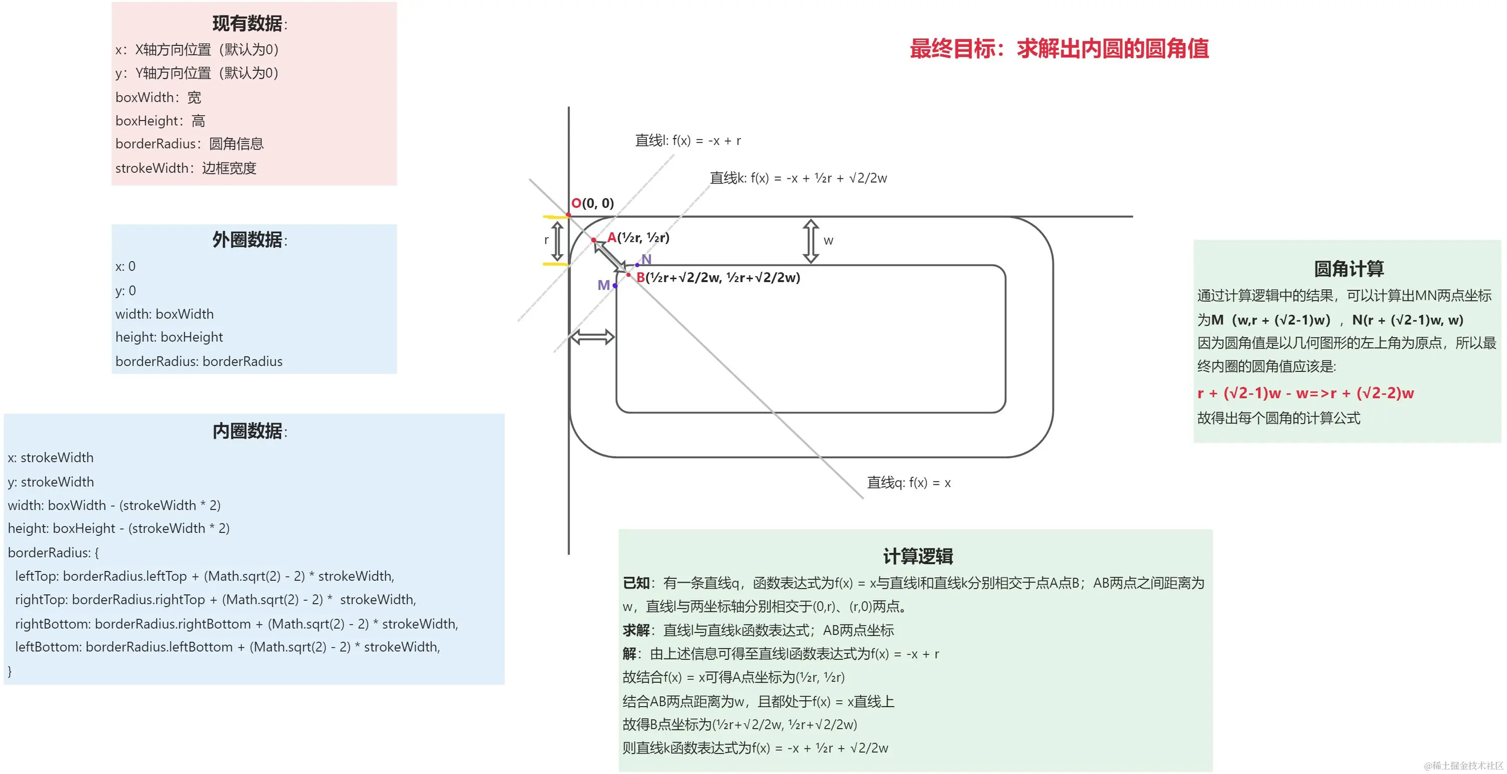
通过CSS样式中的clip-path样式,结合dom元素的after进行叠加遮盖,实现 渐变色 圆角/倒角 边框 的效果
3.1. 内圆 圆角值计算逻辑图解
3.2. CSS绘制逻辑图解
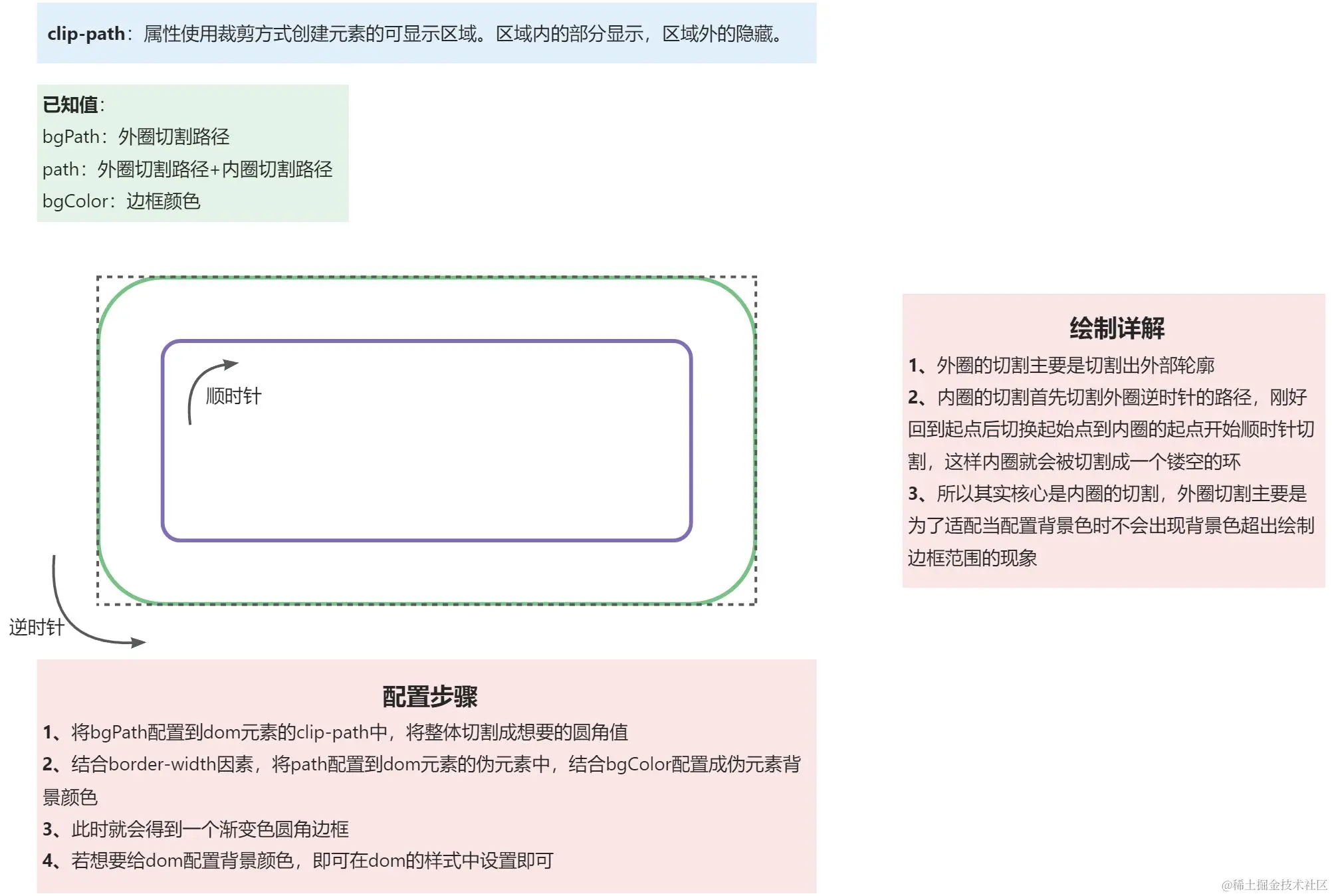
3.3. 绘制外圈圆角矩形路径(按照逆时针方向绘制)
const createOuterRoundedRectPath = (params) => {
const { x, y, width, height, borderRadius } = params;
return (
"M " +
x +
"," +
(y + height / 2 + (height / 2 - borderRadius.leftBottom)) +
" a " +
borderRadius.leftBottom +
"," +
borderRadius.leftBottom +
" 0 0 0 " +
borderRadius.leftBottom +
"," +
borderRadius.leftBottom +
" h " +
(width - (borderRadius.rightBottom + borderRadius.leftBottom)) +
" a " +
borderRadius.rightBottom +
"," +
borderRadius.rightBottom +
" 0 0 0 " +
borderRadius.rightBottom +
"," +
borderRadius.rightBottom * -1 +
" v " +
(height - (borderRadius.rightBottom + borderRadius.rightTop)) * -1 +
" a " +
borderRadius.rightTop +
"," +
borderRadius.rightTop +
" 0 0 0 " +
borderRadius.rightTop * -1 +
"," +
borderRadius.rightTop * -1 +
" h " +
(width - (borderRadius.rightTop + borderRadius.leftTop)) * -1 +
" a " +
borderRadius.leftTop +
"," +
borderRadius.leftTop +
" 0 0 0 " +
borderRadius.leftTop * -1 +
"," +
borderRadius.leftTop +
" z"
);
};
3.4. 绘制内圈圆角矩形路径(按照顺时针方向绘制)
const createInnerRoundedRectPath = (params) => {
const { x, y, width, height, borderRadius } = params;
return (
"M " +
(x + borderRadius.leftTop) +
"," +
y +
" h " +
(width - (borderRadius.rightTop + borderRadius.leftTop)) +
" a " +
borderRadius.rightTop +
"," +
borderRadius.rightTop +
" 0 0 1 " +
borderRadius.rightTop +
"," +
borderRadius.rightTop +
" v " +
(height - (borderRadius.rightBottom + borderRadius.rightTop)) +
" a " +
borderRadius.rightBottom +
"," +
borderRadius.rightBottom +
" 0 0 1 " +
borderRadius.rightBottom * -1 +
"," +
borderRadius.rightBottom +
" h " +
(width - (borderRadius.leftBottom + borderRadius.rightBottom)) * -1 +
" a " +
borderRadius.leftBottom +
"," +
borderRadius.leftBottom +
" 0 0 1 " +
borderRadius.leftBottom * -1 +
"," +
borderRadius.leftBottom * -1 +
" v " +
(height - (borderRadius.leftBottom + borderRadius.leftTop)) * -1 +
" a " +
borderRadius.leftTop +
"," +
borderRadius.leftTop +
" 0 0 1 " +
borderRadius.leftTop +
"," +
borderRadius.leftTop * -1 +
" z"
);
};
3.5. 绘制外圈倒角矩形路径(按照逆时针方向绘制)
const createOuterAngleRectPath = (params) => {
const { x, y, width, height, borderRadius } = params;
return (
"M " +
x +
"," +
(y + height / 2 + (height / 2 - borderRadius.leftBottom)) +
" l " +
borderRadius.leftBottom +
"," +
borderRadius.leftBottom +
" h " +
(width - (borderRadius.rightBottom + borderRadius.leftBottom)) +
" l " +
borderRadius.rightBottom +
"," +
borderRadius.rightBottom * -1 +
" v -" +
(height - (borderRadius.rightBottom + borderRadius.rightTop)) +
" l " +
borderRadius.rightTop * -1 +
"," +
borderRadius.rightTop * -1 +
" h -" +
(width - (borderRadius.rightTop + borderRadius.leftTop)) +
" l " +
borderRadius.leftTop * -1 +
"," +
borderRadius.leftTop +
" z"
);
};
3.6. 绘制内圈倒角矩形路径(按照顺时针方向绘制)
const createInnerAngleRectPath = (params) => {
const { x, y, width, height, borderRadius } = params;
return (
"M " +
(x + borderRadius.leftTop) +
"," +
y +
" h " +
(width - borderRadius.rightTop - borderRadius.leftTop) +
" l " +
borderRadius.rightTop +
"," +
borderRadius.rightTop +
" v " +
(height - borderRadius.rightBottom - borderRadius.rightTop) +
" l " +
borderRadius.rightBottom * -1 +
"," +
borderRadius.rightBottom +
" h " +
-1 * (width - borderRadius.leftBottom - borderRadius.rightBottom) +
" l " +
borderRadius.leftBottom * -1 +
"," +
borderRadius.leftBottom * -1 +
" v " +
-1 * (height - borderRadius.leftTop - borderRadius.leftBottom) +
" l " +
borderRadius.leftTop * -1 +
"," +
borderRadius.leftTop +
" z"
);
};
3.7. 结合内圈&外圈return的路径,返回clip-path样式path的路径数据
【注】这里传递参数时,需要对圆角大小进行限制,不能超过宽高最小值的一半
const getAssemblePath = (outerParams, innerParams, type) => {
const outerRoundPath =
type === "fillet"
? createOuterRoundedRectPath(outerParams)
: createOuterAngleRectPath(outerParams);
const innerRoundPath =
type === "fillet"
? createInnerRoundedRectPath(innerParams)
: createInnerAngleRectPath(innerParams);
return {
borderPath: `${outerRoundPath} ${innerRoundPath}`,
bgPath: `${outerRoundPath}`,
};
};
const handleCalculatePath = (
borderRadius,
type,
strokeWidth,
{ boxWidth, boxHeight }
) => {
let newBorderRadius = {
leftTop: Math.min(borderRadius.leftTop, Math.min(boxWidth, boxHeight) / 2),
rightTop: Math.min(
borderRadius.rightTop,
Math.min(boxWidth, boxHeight) / 2
),
rightBottom: Math.min(
borderRadius.rightBottom,
Math.min(boxWidth, boxHeight) / 2
),
leftBottom: Math.min(
borderRadius.leftBottom,
Math.min(boxWidth, boxHeight) / 2
),
};
const outerParams = {
x: 0,
y: 0,
width: boxWidth,
height: boxHeight,
borderRadius: newBorderRadius,
};
const innerParams = {
x: strokeWidth,
y: strokeWidth,
width: boxWidth - strokeWidth * 2,
height: boxHeight - strokeWidth * 2,
borderRadius: {
leftTop: newBorderRadius.leftTop + (Math.sqrt(2) - 2) * strokeWidth,
rightTop: newBorderRadius.rightTop + (Math.sqrt(2) - 2) * strokeWidth,
rightBottom:
newBorderRadius.rightBottom + (Math.sqrt(2) - 2) * strokeWidth,
leftBottom: newBorderRadius.leftBottom + (Math.sqrt(2) - 2) * strokeWidth,
},
};
const path = getAssemblePath(outerParams, innerParams, type).borderPath;
const bgPath = getAssemblePath(outerParams, innerParams, type).bgPath;
return { path, bgPath };
};
3.8. 生成CSS样式
const handleDrawGraph = (
borderRdius,
type,
borderWidth,
boxWidth,
boxHeight,
borderColor
) => {
const { path, bgPath } = handleCalculatePath(
borderRadius,
type,
borderWidth,
{
boxWidth,
boxHeight
}
);
return {
"--custom-box-clip-path": `path('${path}')`,
"--custom-box-clip-path-bg-path": `path('${bgPath}')`,
"--custom-box-clip-path-bg-color": borderColor
}
}
.custom-box {
position: relative;
width: 100%;
height: 100%;
clip-path: var(--custom-box-clip-path-bg-path);
&::after {
position: absolute;
left: 0;
top: 0;
z-index: -1;
width: 100%;
height: 100%;
background: var(--custom-box-clip-path-bg-color);
clip-path: var(--custom-box-clip-path);
}
}
通过以上设置就可以实现 渐变色/纯色+圆角/倒角 的样式效果
如果您觉得这篇文章有帮助,请点个赞吧~
相关文章
更多文章 →css2026-06-17
外阴影和内阴影介绍
在前端页面设计中,阴影是非常常见的视觉效果。它可以让元素看起来更有层次感,也可以用来表达悬浮、按压、凹陷、卡片、按钮等状态。 CSS 中最常用的阴影属性是 。它既可以实现外阴影,也可以实现内阴影。 一、什么是外阴影 外阴影指的是元素外部的阴影效果。 它会出现在元素边框之外,让元素看起来像是从页面中“浮起来”了一样。常见的卡片、弹窗、按钮悬浮效果,基本都会用到外阴影。 例如: 这个阴影表示:元素下方有一层柔和的黑色阴影,让卡片看起来更有立...
学习
css2026-05-15
border-image-slice详细介绍
是 CSS 系列属性里最关键、也最容易让人懵的一个属性。 它的作用可以简单理解为: 把一张图片切成九宫格,然后决定哪几块用来绘制元素的边框。 它通常和这些属性一起使用: 或者简写成: 其中 决定“怎么切图”。 一、 是什么? 普通的 只能画纯色边框: 但有时候我们想用图片作为边框,比如: 游戏按钮边框 像素风 UI 复古窗口 聊天气泡 卡牌边框 花纹装饰框 九宫格按钮背景 这时候就可以用 。 例如一张按钮图片长这样: 我们希望按钮变宽时...
学习
css2026-03-05
如何在最小副作用下创建 BFC
在 CSS 布局的江湖中, BFC (Block Formatting Context,块级格式化上下文) 是一个老生常谈却又至关重要的概念。无论是解决 高度塌陷 、 清除浮动 ,还是防止 垂直外边距重叠 ,BFC 都是我们的得力助手。 但是,创建 BFC 的方法有很多: 、 、 、 …… 哪种方法对现有布局的“破坏”最小? ❌ 过去的老方法 在过去,为了触发 BFC,我们不得不使用一些带有副作用的“黑客”技巧: : 元素会脱离文档流,...
学习
css2026-03-03
CSS过渡性能解析:transition: all
CSS过渡性能深度解析:为什么 可能是你页面的隐形杀手 一、引言:一个被忽视的性能陷阱 你是否曾在项目中这样写: 看似简洁优雅,却可能在低端设备上引发卡顿、掉帧。 真相 : 是前端性能优化中高频出现的“隐形陷阱”。本文将彻底揭开它的面纱。 二、核心概念: 到底在控制什么? 指定 哪些CSS属性变化时触发动画过渡 。它是过渡效果的“守门员”: | 值 | 含义 | 生成的CSS | | | | | | | 所有 可过渡属性变化时均触发动画...
学习
css2026-01-26
在CSS中,四种高度视口单位的区别
在CSS中,视口单位是构建响应式网页设计的重要工具,特别是针对移动端开发。除了传统的 ,CSS新引入了 、 和 等更精确的单位,解决传统单位在移动端的局限性。 四种高度视口单位的区别 | 单位 | 全称 | 含义 | 特点 | | | | | | | vh | Viewport Height | 传统视口高度单位,1vh = 视口高度的1% | 在移动端有问题:不考虑浏览器UI变化,经常导致内容被遮挡或出现意外滚动 | | svh |...
学习
css2025-11-04
keyframes 关键帧机制
一、什么是 @keyframes? 用于定义动画在不同时间点(关键帧)的样式变化;配合 属性应用到元素上。 定义动画 :使用 声明关键帧序列; 应用动画 :在选择器中通过 / 相关长属性控制表现。 二、基本语法 等价写法( / ): 三、与 属性配合使用 /相关长属性 | 属性名 | 含义 | 示例值 | | : | : | : | | | 动画名称 | | | | 持续时长 | 、 | | | 速度曲线 | / / / | | | 延...
学习
评论
请登录后发表评论
去登录